A practical open-floor-plan palette starts with one main wall color. Add related colors only where the architecture provides a clean stopping point. Map every shared sightline, compare samples beside fixed finishes, and approve the complete palette inside your home.
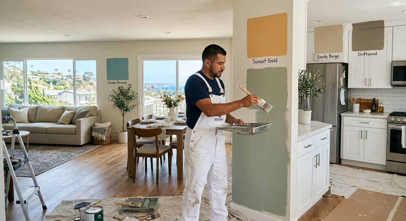
Map connected walls and sightlines
Start by walking the space from every normal entrance. Pause at the front door, hallway, kitchen, dining area, and main seating position. Write down every wall you can see from each spot.
Next, identify where each wall begins and ends. Inside corners, outside corners, door casings, built-ins, and ceiling changes can provide clear boundaries. Avoid planning a color change in the middle of one continuous wall. That split can look accidental unless it supports a deliberate feature.
Give every visible surface a simple name. “Entry wall,” “kitchen return,” and “dining window wall” are clearer than room names alone. Open concept paint colors must account for walls shared by several zones. A wall called “living room” on a floor plan may also frame the dining area.
Photograph the major sightlines. Then place the images beside a rough floor plan. You don’t need architectural drawings. A hand sketch can show which colors will appear together.
Use your own San Diego home as the reference. A palette seen in an Encinitas showroom won’t show how it fits a home in Chula Vista, North Park, or El Cajon. The home’s layout and existing finishes should control the decision.
If several walls need repairs or full repainting, review the plan with an interior painting professional. Ask the quoting painter to identify practical stopping points before final colors are selected.
Compare undertones beside fixed finishes
The wall color isn’t the only color in an open plan. Flooring, countertops, cabinets, tile, trim, upholstery, and large rugs all remain visible. Treat those fixed finishes as part of the palette.
Bring sample cards or painted boards beside each major finish. Don’t compare them across the room. Hold the sample next to the flooring, cabinet door, backsplash, and trim. Look for combinations that feel calm rather than slightly unsettled.
Name what you see in plain language. Does the sample seem pink beside the floor? Does it look green near the cabinets? Does the countertop make it feel yellow or gray? You don’t need perfect color vocabulary. You only need to notice whether the pairing still feels right.
A connected living and kitchen area deserves one shared review. Don’t choose the living-room color first and solve the kitchen later. Our guide to living-room paint colors in San Diego can help develop that part of the palette without treating it as an isolated room.
Keep the number of candidates manageable. Compare one main wall option with a small group of related accents. You can browse a manufacturer’s color collections, but don’t approve a color from an online image alone.
A color consultation can help when cabinets, stone, flooring, and furniture appear to pull in different directions. An independent consultant can organize those competing elements into one usable selection process.
Test samples in changing room light
Move the finalists from the screen and sample card onto larger boards. Place one board on each connected wall instead of judging everything from one position. Label every sample so similar choices don’t get mixed up.
Check the boards in the morning, around midday, and after sunset. Turn on the lamps and overhead fixtures you normally use. Record which sample you prefer at each time and location. A simple note is more reliable than trying to remember yesterday’s impression.
Repeat the test from your main sightlines. Look from the entry toward the kitchen. Sit where you normally sit. Stand near the dining table. Check any hallway that opens into the shared space. The winning sample should make sense wherever connected rooms appear together.
Pay special attention to white. “White” describes a broad family of choices, not one automatic answer. Compare each candidate beside the existing trim, ceiling, cabinets, and upholstered furniture. The guide to painting a living room white in San Diego offers a focused process for that decision.
Don’t approve a palette under store lighting and send it directly to the painter. A choice made at a store in Kearny Mesa still needs testing inside a home in La Jolla, San Ysidro, or Scripps Ranch.
Keep rejected sample boards until the final decision is documented. They provide a useful record of what was considered. They can also prevent a near-duplicate color from returning to the shortlist.
Choose sheen after checking wall condition
Color and sheen are separate decisions. Review them together only after inspecting the actual surfaces. Start with the most visible wall, especially one facing windows or overhead fixtures.
Look across the wall from the side. Mark patches, dents, texture changes, cracks, stains, and old repair lines. Ask the painter which areas belong in the preparation scope. A new color won’t replace the need for an agreed repair plan.
Then test the candidate sheen on a representative section or sample board. View it from the sofa, dining area, kitchen, and entry. Decide whether you like the amount of reflected light and how the surface looks from those positions.
Don’t assume every surface needs the same finish. Walls, ceilings, trim, doors, and cabinets can receive separate selections. Document each choice rather than telling the painter to use “the usual sheen.” For a closer comparison, use this San Diego paint sheen guide.
Older painted surfaces need another checkpoint. Based on the approved local housing data, 49.6% of housing units in the City of San Diego were built before 1978. That citywide figure doesn’t establish the age of your home, so confirm the construction year through your own property records.
When paid work disturbs painted surfaces in pre-1978 housing, the federal EPA Renovation, Repair and Painting program requires certified firms to follow lead-safe practices. Ask the painter how that rule applies before sanding or other surface disturbance begins.
Confirm one palette across adjoining spaces
Create one final palette sheet before materials are ordered. List every room, wall, color name, color code, and selected finish. Include separate entries for ceilings, trim, doors, built-ins, and cabinets when they’re part of the project.
Attach a marked floor plan or your labeled photographs. This gives the painter a visual reference for every transition. It also makes unclear instructions easier to catch before painting starts.
Review adjoining surfaces in pairs. Match the entry wall with the living area. Compare the living area with the dining wall. Check the dining wall against the kitchen. Continue until every visible connection has been reviewed.
One whole house color palette doesn’t require one color everywhere. It means every choice was considered beside the colors visible from the same space. A feature wall can belong in the plan when its boundaries and purpose are clear. A disconnected accent chosen from a single photograph deserves another review.
Ask one final set of practical questions:
- Where does each color start and stop?
- Which color continues through shared hallways?
- Are the trim and ceiling colors staying or changing?
- Which sheen belongs on each surface?
- Have repaired areas been included in the scope?
- Has every sample been approved inside the home?
Have the quoting painter repeat the palette back from the written sheet. If an independent consultant prepared the colors, share the same document with everyone reviewing the project. That final check turns several room-by-room decisions into one clear plan.
When to call us
Call when connected rooms, fixed finishes, wall repairs, or unclear color transitions make the decision hard to settle. Call us at (858) 400-6422 and we’ll connect you with a licensed local painter.